Interface anatomy
Why this matters
ZaazCRM is designed so you find everything in a few clicks. Before you dive into individual modules, it's worth spending three minutes understanding what each part of the screen does. Once you know where search, the side menu, and your profile live, the rest of the manual gets easier to follow.
The four zones of the screen
No matter where you are in ZaazCRM, the screen always has the same structure:
- Top bar (top, fixed) — global search, language, light/dark theme, your user menu.
- Sidebar (left, collapsible) — every module organized into groups.
- Main area (center, takes most of the screen) — what you're looking at right now: the dashboard, a contact list, a case detail, a form.
- Profile drawer (right, opens when you click your avatar) — shortcuts to your profile, settings, language, theme, and sign out.
The top bar
From left to right:
- Menu button — collapses or expands the sidebar. Useful for wide tables or small screens.
- Your company's logo — clicking it takes you back to the dashboard.
- Search (magnifying glass icon) — opens global search. More in Search and filters.
- Language (ES / EN badge) — switches the interface language instantly. Your choice is saved to your profile.
- Theme (sun/moon icon) — toggles light and dark mode. Saved to your profile.
- Your avatar — clicking it opens the profile drawer with your personal options.

The sidebar
Every module lives here: contacts, leads, companies, cases, quotes, invoices, products, email, files, calendar, reports, settings. Modules are organized into collapsible groups — click a group to expand it.
Above the list there's a filter field (Filter by name...) — type part of a module name and the list shrinks. Useful when your company has many custom modules.
Each module in the sidebar takes you to its list view (all records). To create a new one, look for the Create or New button in the upper-right of the main area once you're inside the module.
The profile drawer
When you click your avatar (upper-right corner), a panel slides in from the right with four sections:
- Your identity — photo, full name, account email.
- Language — English, Español. Switches immediately.
- Profile — links to My Profile (view and edit your information) and Settings (personal preferences and, if you have permission, company-wide settings).
- Theme — light or dark.
- Sign out — at the bottom of the drawer. Logs you out immediately.
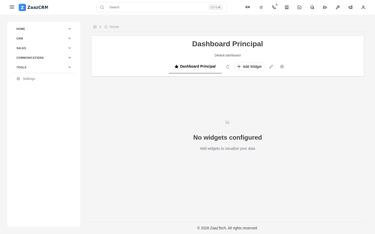
The dashboard
The first screen you see when you sign in is your dashboard — a configurable set of widgets showing what matters most to you: pending tasks, leads to follow up, open cases, pending collections, upcoming meetings, activity charts. Each user can build their dashboard their own way. More on this in Dashboards and widgets.
Watch out for
- The profile drawer closes when you click outside it. This is not a bug — it's designed to stay out of your way. There's no way to pin it open while you work: open it, pick what you need, it goes away.
- The sidebar is collapsed by default on small screens. On tablet or phone it's hidden and only appears when you tap the menu button. This is intentional, to give the main area room.
- The interface language doesn't affect your data. If you have a contact with notes in Portuguese or a case with Italian text, those stay the same regardless of which language you picked.
Where to next
- Your profile — set your personal info, photo, password, language, and time zone.
- Navigating modules — how to move between the list, detail, and forms of any module.